
 |
| This painting by Christopher Wool, or a replica, sold for $7.7 million at auction in 2012, per Wikipedia. |
Christopher Wool
Art Institute of Chicago
Thru May 14, 2014
Exhibit website
Exhibit website
I realize that there are plenty of artists--and tons of art--that I love yet others don't care for, or even about.
It's also true that many an artist now widely considered brilliant was derided, or simply ignored, in his or her time.
The Impressionists were considered the scourge of the French art world when they arose in the late 19th century, with Monet and Manet being largely disdained by critics.
Though many of his works would now fetch well over $100 million at auction, Van Gogh sold only one painting in his lifetime and died penniless.
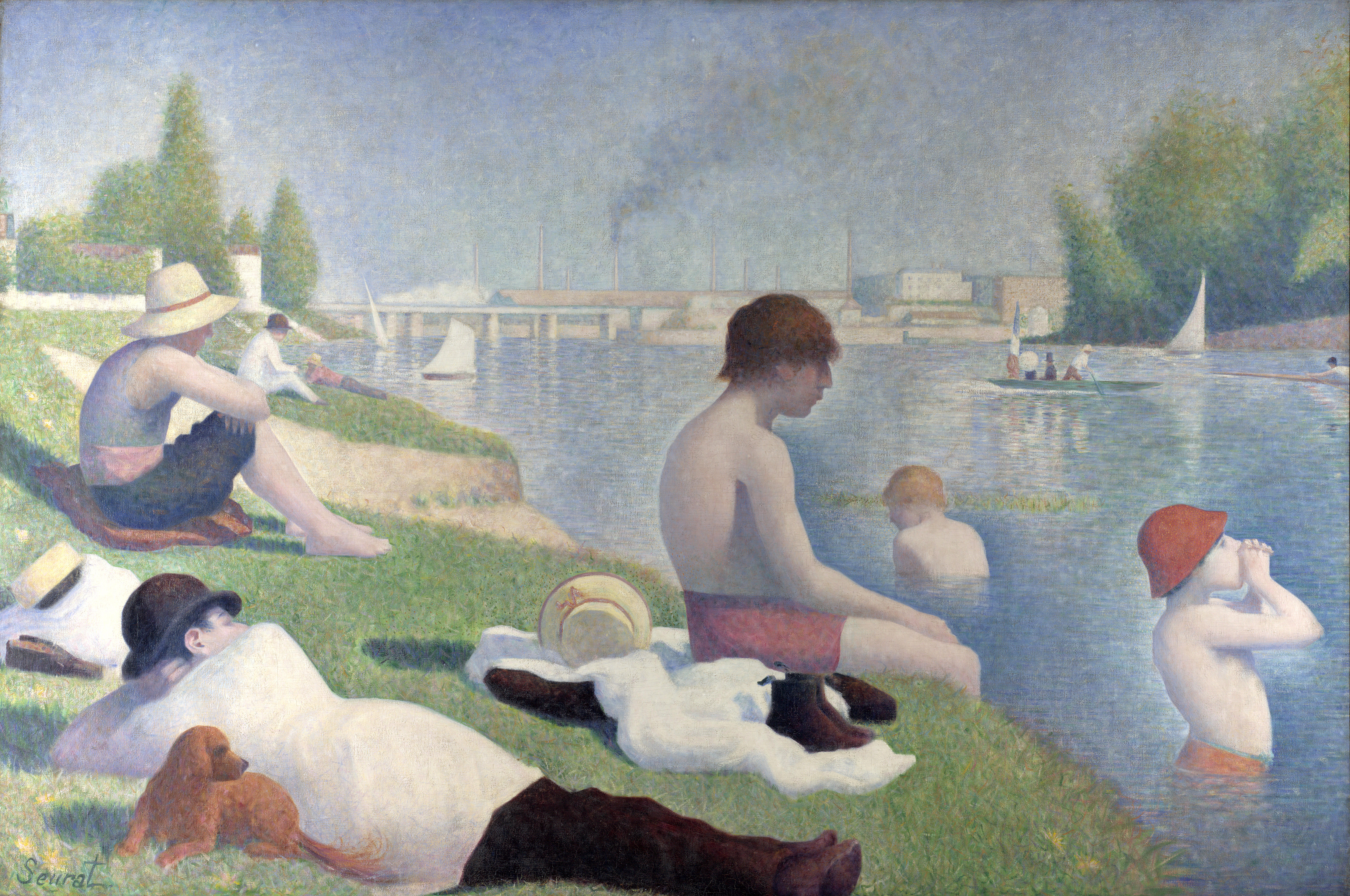
While the Art Institute of Chicago's prized Sunday Afternoon on the Isle of La Grande Jatte by Seurat may well be my favorite of any painting anywhere, in his brilliant musical imagining its creation--Sunday in the Park with George--Stephen Sondheim includes a historically-truthful song ("No Life") in which high-brow art patrons rebuke Seurat and one of his preceding masterpieces.
 |
| by Christopher Wool |
I give this preamble not just in an attempt to defray sounding like a complete philistine for what I'm about to say, but in hopes that I will someday--perhaps even soon--realize that I am wrong.
But already rather unimpressed--or at least unmoved--by almost all examples I've seen of museum-selected and presented contemporary art, I had this general aversion further confirmed by a walk through the Art Institute of Chicago's major exhibition on Christopher Wool.
Don't feel sheepish if you just went, "Who?"
Other than via a check of the museum's website, I had never heard of Wool before arriving at the Art Institute last Thursday afternoon prior to attending a CSO concert across the street.
 |
| Pierre-Auguste Renoir - Madame Léon Clapisson, 1883 (original at left) |
Though I was uninitiated going in, I was somewhat excited to note that the Art Institute--which I consider one of the world's very best--had deemed a living artist worthy of such an extensive exhibit (Wool is an American, born in 1955).
Because honestly, I can scarcely name a currently-working, museum-level painter that I like.
The only two that readily come to mind are Chuck Close, who at 73 doesn't seem to be creating much new work, and Jack Vettriano, who I wrote about in 2010, but whose paintings seem to be more the province of galleries than museums.
 |
| The painting at left is Apocalypse Now; it sold for $26.4 million |
Still, while I can't cite much that I've ever liked in Chicago's Museum of Contemporary Art or among newer works within the Art Institute's Modern Wing, I want to believe that great extant painters with the talent and vision to rise above today's digitized din aren't as nearly extinct as great rock bands comprised of members born after the Carter administration.
Well, while intending this to reflect my general disappointment with contemporary art, rather than explicitly excoriate the Art Institute's exhibit, or Wool himself--who must have many esteemed admirers to have earned such a prestigious showing--I can't say I really liked, or admired, much of what I saw.
 |
| More of Christopher Wool's "Word" paintings |
I fully agree with her.
And yet, simply in terms of seeing art that I enjoyed and appreciated, I have gotten more pleasure and enrichment from walking through a decent suburban art fair than I did perusing the numerous galleries of Wool's work.
To be fair, there is a certain amount of whimsy in Wool's "Word paintings," and I've come to realize that in contemporary art, having an original gimmick is just as important--if not more so--than creating anything likely to be seen as beautiful, or truly brilliant.
And just to prove that I'm merely an idiot with an opinion and not an accurate arbiter of artistic merit, Wikipedia's bio of Christopher Wool imparts the following:
Wool's Word paintings made between the late 1980s and early 2000s are the most sought-after pieces on the art market; as of 2013, seven “word” works feature in Wool’s top ten auction sales. At Christie's London in February 2012, Untitled (1990), a later word painting bearing the broken word FOOL, sold for £4.9 million ($7.7 million). In November 2013, art dealer Christophe van de Weghe bought Apocalypse Now (1988) [which features words from a famous line in Francis Ford Coppola's film] for $26.4 million on behalf of a client at Christie's New York.So I don't imagine Mr. Wool would be all that distraught to learn that I wasn't all that wowed by his artworks. Nor should he be.
 |
| Works by Christopher Wool |
Certainly, as they say, beauty is in the eye of the beholder.
And if you love what you see, by all means tell me why.
For while I have come to appreciate much beauty, and depth, in the paintings of relative minimalists like Kandinsky, Miro, Pollack, Gorky, Mondrian, de Kooning, Dubuffet, Rothko, Motherwell, Lichtenstein, Warhol, Jasper Johns--who, I should note, is still alive--and others, I can't help but think of "The Emperor's New Clothes" when, even a few days later, I consider the abstracts featured in the Art Institute's Christopher Wool exhibition.
 |
| Cy Twombly - The First Part of the Return from Parnassus, 1961 |
Together with [Robert] Rauschenberg and Jasper Johns, Twombly is regarded as the most important representative of a generation of artists who distanced themselves from Abstract Expressionism.
Again, I'll defer to more expert assessors, but I recall walking through the galleries at the Menil dumbfounded by art that looked like stuff that would get a 3-year-old scolded for writing on the walls. There, too, I asked anyone I could find--docents, security guards, other patrons, etc.--to try to enlighten me to the greatness I was missing.
I included here a photo of a Twombly work that I coincidentally just noticed at the Art Institute; it's called The First Part of the Return from Parnassus and was created in 1961.
 |
| El Greco - The Feast in the House of Simon, 1608/14 |
So it's not like Christopher Wool is the first "museum-quality" artist whose work has befuddled me. And I'm sure he won't be the last.
And despite not loving it, I really do appreciate the Art Institute deciding to curate the extensive exhibition.
Nowadays, special exhibits at the AIC are included in the general admission price and/or membership fees, and there have been a number of past exhibitions that have opened my eyes to artists I didn't previously know but whose work I enjoyed (primarily in the photography realm, such as William Eggleston).
And just to now know who Christopher Wool is, I guess is something.
But, while knowing that this is all subjective, I would regret tourists who visit the Art Institute devoting considerable chunks of their limited time to the Christopher Wool exhibit--presumably after "making a point" of seeing the Seurat and other great Impressionist works, plus Edward Hopper's Nighthawks, Grant Wood's American Gothic and a few select others--rather than discovering, say, the multiple miraculous paintings by El Greco in the museum's collection, and even a Botticelli.
 |
| Elizabeth Sparhawk-Jones - Shoe Shop, 1911 |
One of these was called Shoe Shop, painted in 1911 by Elizabeth Sparhawk-Jones. If I had seen the work or heard her name before, I didn't recall it.
But without bothering to try to define or debate what "art" is at this juncture, this one random painting certainly seemed a lot more artful than some seemingly random black scribbles or a large stenciled "FOOL."
Though, again, circling back to where I began, I realize people said the same things about the works of Kandinsky, Miro, Pollack, Rothko and others who created new genres by being daringly ahead of their time.
So perhaps I just haven't caught up to the genius of Christopher Wool.
As I said above, I really hope to realize what I'm missing, and come to love it. Feel free to help me get there.
Yet while I won't be Neanderthal enough to say, "It looks like something I could do," or even your average small child, if "FOOL" fetched $7.7 million, perhaps I'm due at least $19.95.
 |
| Seth Arkin - It Used to Be OK, 1991 |
My paintings--see several at this link--were all gimmick, with no real talent or technique.
When I left L.A., I gave one of the paintings shown here--It Used to Be OK--to my friend, Ray Cuevas, a longtime painter who has sold numerous works through prestigious galleries and auctions.
Ray is also an extensive collector who obviously knows great art, but yet he loved my piece of garbage.
In addition to liking my concept of cutting apart the letters "OK" and colorizing the pieces by masking the areas around them, to this day Ray praises my "brilliant use of white space."
I don't really believe it, but remain happy that Ray liked what I did, even if my painting is undoubtedly hidden behind piles of others in his garage. Still, I certainly don't think it, or any of my silly paintings, merited any money.
 |
| Seth Arkin - HOPE, 1993 |
If the value of "FOOL" is to be believed, "OK" could be worth millions.
Or perhaps, my my slightly more literal "HOPE" is.
I think that one's at my mom's house, in case any world-class museums want to make an inquiry.
Or if you would like to make an offer.
Bidding starts at $1.3 million.
But I'd be thrilled with $19.95.
 |
| More works by Christopher Wool |
2 comments:
Start with THESHOWISOVER, which is the first piece you encounter past the introductory display. Figure out what it says. Then, start at the top and count the letters in the first line. Realize that each letter is directly on top of the lower ones, there's a grid with no spaces.
In the second line, you will see that Wool has started to change his mind, to erase some letters and cover them with his spaceless words. You notice some irregularities in his painting together with the rigidity he is working with.
At this point, you realize that Wool is showing you his whole process. The things we get rid of in order to clarify the design we've achieved, Wool keeps for us to think about.
Wool said in the Friday lecture that he got self-conscious about taking words and using them and stopped doing it quite a while ago. He continues to lay things out, and then recopies them or covers them up.
We can see what he is doing, what he has done as we look at his stuff. Linen, aluminum, silkscreen, spray gun, he's left traces for us to contemplate. I'd take home whichever one I could. A middle sized blotchy painting would be fine, or a bigger one with drips--some drip upward which makes you think.
GW
I thought that the OK painting is pretty good. You're not a good painter on the whole. That's best demonstrated in the fact that you made that painting with the beautiful shapes and covered it with bands of black and white lines distracting from the beauty that was already there.
Post a Comment