Showing posts with label Art Institute. Show all posts

Tuesday, March 04, 2014

Pulling the Christopher Wool Over My Eyes? -- Pondering the Current State of Art

This painting by Christopher Wool, or a replica,
sold for $7.7 million at auction in 2012, per Wikipedia.
(Article covers but doesn't specifically rate the following exhibition:)

Christopher Wool
Art Institute of Chicago
Thru May 14, 2014
Exhibit website

I realize that there are plenty of artists--and tons of art--that I love yet others don't care for, or even about.

It's also true that many an artist now widely considered brilliant was derided, or simply ignored, in his or her time.

The Impressionists were considered the scourge of the French art world when they arose in the late 19th century, with Monet and Manet being largely disdained by critics. 

Though many of his works would now fetch well over $100 million at auction, Van Gogh sold only one painting in his lifetime and died penniless.

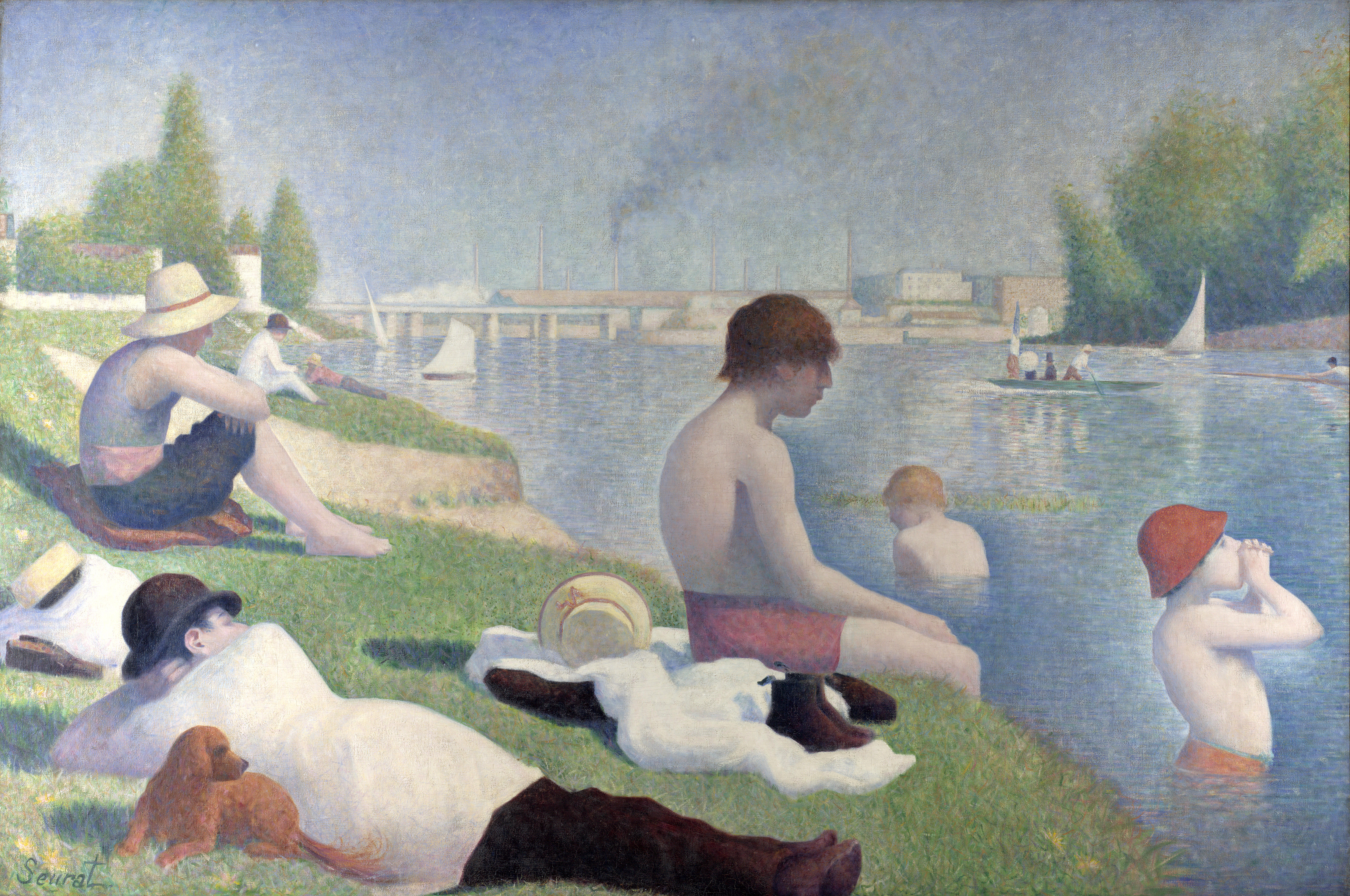
While the Art Institute of Chicago's prized Sunday Afternoon on the Isle of La Grande Jatte by Seurat may well be my favorite of any painting anywhere, in his brilliant musical imagining its creation--Sunday in the Park with George--Stephen Sondheim includes a historically-truthful song ("No Life") in which high-brow art patrons rebuke Seurat and one of his preceding masterpieces.

by Christopher Wool
And even though I like to think the swath of art I now embrace is rather broad, it wasn't until I visited some of the great museums in Europe--the Louvre, Prado, Uffizi Gallery, Vatican Museum, Rijksmuseum, Hermitage, National Gallery, Kunsthistorisches, etc.--that I came to properly appreciate the masters of the Renaissance and others who preceded or followed it, including Raphael, Titian, Durer, Vermeer, Velázquez and Murillo, just to drop a few exalted names.

I give this preamble not just in an attempt to defray sounding like a complete philistine for what I'm about to say, but in hopes that I will someday--perhaps even soon--realize that I am wrong.

But already rather unimpressed--or at least unmoved--by almost all examples I've seen of museum-selected and presented contemporary art, I had this general aversion further confirmed by a walk through the Art Institute of Chicago's major exhibition on Christopher Wool.

Don't feel sheepish if you just went, "Who?"

Other than via a check of the museum's website, I had never heard of Wool before arriving at the Art Institute last Thursday afternoon prior to attending a CSO concert across the street.

Pierre-Auguste Renoir - Madame Léon Clapisson, 1883 (original at left)
After discovering that the museum's exhibit on Renoir features just a single painting, Madame Léon Clapisson, whose background formerly had a darker hue--as the museum's conservation department found and digitally recreated--and that a photography exhibition Christopher Williams: The Production Line of Happiness had some nice works but seemed rather disjointedly organized, I ambled to Regenstein Hall--the Art Institute's largest exhibition space--to explore Christopher Wool.

Though I was uninitiated going in, I was somewhat excited to note that the Art Institute--which I consider one of the world's very best--had deemed a living artist worthy of such an extensive exhibit (Wool is an American, born in 1955).

Because honestly, I can scarcely name a currently-working, museum-level painter that I like.

The only two that readily come to mind are Chuck Close, who at 73 doesn't seem to be creating much new work, and Jack Vettriano, who I wrote about in 2010, but whose paintings seem to be more the province of galleries than museums.

The painting at left is Apocalypse Now; it sold for $26.4 million
And had they not died young, I imagine Keith Haring and Jean-Michel Basquiat would still be doing some interesting stuff.

Still, while I can't cite much that I've ever liked in Chicago's Museum of Contemporary Art or among newer works within the Art Institute's Modern Wing, I want to believe that great extant painters with the talent and vision to rise above today's digitized din aren't as nearly extinct as great rock bands comprised of members born after the Carter administration.

Well, while intending this to reflect my general disappointment with contemporary art, rather than explicitly excoriate the Art Institute's exhibit, or Wool himself--who must have many esteemed admirers to have earned such a prestigious showing--I can't say I really liked, or admired, much of what I saw.

More of Christopher Wool's "Word" paintings
I genuinely tried not to be close-minded and dismissive, to the point of asking a security guard for her assessment after overhearing her suggest to a colleague that patrons saying, "I could do that"--which I never uttered--is insulting and belittling to the featured artist.

I fully agree with her.

And yet, simply in terms of seeing art that I enjoyed and appreciated, I have gotten more pleasure and enrichment from walking through a decent suburban art fair than I did perusing the numerous galleries of Wool's work.

To be fair, there is a certain amount of whimsy in Wool's "Word paintings," and I've come to realize that in contemporary art, having an original gimmick is just as important--if not more so--than creating anything likely to be seen as beautiful, or truly brilliant.

And just to prove that I'm merely an idiot with an opinion and not an accurate arbiter of artistic merit, Wikipedia's bio of Christopher Wool imparts the following: 
Wool's Word paintings made between the late 1980s and early 2000s are the most sought-after pieces on the art market; as of 2013, seven “word” works feature in Wool’s top ten auction sales. At Christie's London in February 2012, Untitled (1990), a later word painting bearing the broken word FOOL, sold for £4.9 million ($7.7 million). In November 2013, art dealer Christophe van de Weghe bought Apocalypse Now (1988) [which features words from a famous line in Francis Ford Coppola's film] for $26.4 million on behalf of a client at Christie's New York. 
So I don't imagine Mr. Wool would be all that distraught to learn that I wasn't all that wowed by his artworks. Nor should he be.

Works by Christopher Wool
But while I can see some merit if not wonderment in his word paintings, as a whole the more abstract stuff impressed me even less. Some were better than others--and I even like the sense of chaotic verve contained within--but there was nothing I'd want to hang in my living room, even if the museum let me take my pick home with me.

Certainly, as they say, beauty is in the eye of the beholder.

And if you love what you see, by all means tell me why.

For while I have come to appreciate much beauty, and depth, in the paintings of relative minimalists like Kandinsky, Miro, Pollack, Gorky, Mondrian, de Kooning, Dubuffet, Rothko, Motherwell, Lichtenstein, Warhol, Jasper Johns--who, I should note, is still alive--and others, I can't help but think of "The Emperor's New Clothes" when, even a few days later, I consider the abstracts featured in the Art Institute's Christopher Wool exhibition.

Cy Twombly - The First Part of the Return from Parnassus, 1961
I am reminded of a visit, about 10 years ago, to the esteemed Menil Collection in Houston. Prominent in their holdings is the Cy Twombly Pavilion, featuring numerous works by Twombly, who is extolled on Wikipedia as such:

Together with [Robert] Rauschenberg and Jasper Johns, Twombly is regarded as the most important representative of a generation of artists who distanced themselves from Abstract Expressionism. 

Again, I'll defer to more expert assessors, but I recall walking through the galleries at the Menil dumbfounded by art that looked like stuff that would get a 3-year-old scolded for writing on the walls. There, too, I asked anyone I could find--docents, security guards, other patrons, etc.--to try to enlighten me to the greatness I was missing.

I included here a photo of a Twombly work that I coincidentally just noticed at the Art Institute; it's called The First Part of the Return from Parnassus and was created in 1961.

El Greco - The Feast in the House of Simon, 1608/14
And I still don't get it.

So it's not like Christopher Wool is the first "museum-quality" artist whose work has befuddled me. And I'm sure he won't be the last.

And despite not loving it, I really do appreciate the Art Institute deciding to curate the extensive exhibition.

Nowadays, special exhibits at the AIC are included in the general admission price and/or membership fees, and there have been a number of past exhibitions that have opened my eyes to artists I didn't previously know but whose work I enjoyed (primarily in the photography realm, such as William Eggleston).

And just to now know who Christopher Wool is, I guess is something. 

But, while knowing that this is all subjective, I would regret tourists who visit the Art Institute devoting considerable chunks of their limited time to the Christopher Wool exhibit--presumably after "making a point" of seeing the Seurat and other great Impressionist works, plus Edward Hopper's Nighthawks, Grant Wood's American Gothic and a few select others--rather than discovering, say, the multiple miraculous paintings by El Greco in the museum's collection, and even a Botticelli.

Elizabeth Sparhawk-Jones - Shoe Shop, 1911
Heck, as soon as I exited the Wool exhibition space, I walked into the nearby American galleries and saw numerous paintings by artists whose names I didn't know that were leaps and bounds better--at least to my eyes--than anything contained within the exhibit. 

One of these was called Shoe Shop, painted in 1911 by Elizabeth Sparhawk-Jones. If I had seen the work or heard her name before, I didn't recall it.

But without bothering to try to define or debate what "art" is at this juncture, this one random painting certainly seemed a lot more artful than some seemingly random black scribbles or a large stenciled "FOOL."

Though, again, circling back to where I began, I realize people said the same things about the works of Kandinsky, Miro, Pollack, Rothko and others who created new genres by being daringly ahead of their time.

So perhaps I just haven't caught up to the genius of Christopher Wool.

As I said above, I really hope to realize what I'm missing, and come to love it. Feel free to help me get there.

Yet while I won't be Neanderthal enough to say, "It looks like something I could do," or even your average small child, if "FOOL" fetched $7.7 million, perhaps I'm due at least $19.95.

Seth Arkin - It Used to Be OK, 1991
Years ago, largely when I lived in Los Angeles from 1990-92, I dabbled in painting. Especially with a number of friends at the time who were amazing artists, I would be the first to say that I was lousy.

My paintings--see several at this link--were all gimmick, with no real talent or technique.

When I left L.A., I gave one of the paintings shown here--It Used to Be OK--to my friend, Ray Cuevas, a longtime painter who has sold numerous works through prestigious galleries and auctions.

Ray is also an extensive collector who obviously knows great art, but yet he loved my piece of garbage.

In addition to liking my concept of cutting apart the letters "OK" and colorizing the pieces by masking the areas around them, to this day Ray praises my "brilliant use of white space."

I don't really believe it, but remain happy that Ray liked what I did, even if my painting is undoubtedly hidden behind piles of others in his garage. Still, I certainly don't think it, or any of my silly paintings, merited any money.

Seth Arkin - HOPE, 1993
But now I'm thinking I never should have cut apart the O and K.

If the value of "FOOL" is to be believed, "OK" could be worth millions.

Or perhaps, my my slightly more literal "HOPE" is.

I think that one's at my mom's house, in case any world-class museums want to make an inquiry.

Or if you would like to make an offer.

Bidding starts at $1.3 million.

But I'd be thrilled with $19.95.

More works by Christopher Wool

Tuesday, February 26, 2013

'Picasso and Chicago' Exhibits Impressive Collections More than Cogent Connections -- Art Exhibition Review

Art Exhibition Review

Picasso and Chicago
The Art Institute of Chicago
Thru May 12
@@@@
Website

I consider Pablo Picasso an absolute genius.

His ability to transverse myriad modes and mediums over an 80-year career is largely unmatched in the annals of art history, and in liking a great deal of his output and admiring his insatiable sense of exploration, he stands--IMHO--alongside The Beatles and Charlie Chaplin as the greatest creative forces of the 20th Century. (With apologies to Mssrs. Gershwin, Sondheim, Coltrane, FL Wright, Hitchcock, Hemingway and whoever I'm overlooking.)

As such, any gathering of his paintings--especially with a sprinkling of sculpture, drawings, prints, ceramics and a solid dose of curatorial insight--will likely be enjoyable, even exciting, for me.

And the Art Institute's new exhibition, Picasso and Chicago--conveniently accompanying an across-the-board admission price increase--is.

Simply at (anamorphic, askew, inverted and cubed, etc.) face value, the 250 pieces on display offered more than enough to keep me pleasurably immersed for two hours, with a return visit not out of the question (abetted by my being an AIC member).

Given my particular fascination with Picasso's pre-Blue and Rose period paintings from 1900-1901, it was nice to see the one at right--Old Woman (Woman With Gloves)--on loan from the Philadelphia Museum of Art.

And in eschewing a full-scale "greatest hits" show featuring an abundance of borrowings from worldwide museums in favor of showcasing its own Picasso holdings--including many less famous works not typically on display--and about 50 pieces from local private collections, the Art Institute does a nice job in digging a bit deeper into the master's multifaceted oeuvre.

I don't know for certain that the gouache, woodcut and drawing below aren't readily seen, but I don't recall them and enjoyed the way they complemented the more glorious full-color oil paintings (such as The Red Armchair, just underneath, for which Picasso also used Ripolin, as explained in a brief movie I wished delved deeper in technique than materials).


Certainly, there was much interesting--and per the eye of the beholder, beautiful--artwork on display, nicely augmented by wall text that broached Picasso's forays into numerous genres.

I appreciated this insight that was imparted on the text panel for the "1920's":  

"In 1915...while he was still very much engrossed in Cubist experimentation, he began simultaneously to pursue Classicism. From that point on, his concurrent exploration of styles would become one of the hallmarks of both his talent and reputation."

Whether you are an art aficionado or novice, I certainly wouldn't dissuade you from taking in this exhibit, either as a local or a tourist. In fact, the Art Institute is the #1 attraction I recommend for Chicago visitors.

All this said, for anyone residing beyond Rockford or Milwaukee, I'm not sure the Picasso and Chicago exhibit merits a special trip.

Given the purview of the exhibition--which in part commemorates the 100th anniversary of the Art Institute's Armory Show, which provided Picasso his foremost exposure in America as of 1913--most of the major pieces shown are always on display at the Art Institute, where of late they've comprised the best part of the otherwise mediocre (art-wise) Modern Wing. (A bit oddly, perhaps the best borrowed Picasso newly on display in Chicago--Three Musicians, at right, from Philadelphia--is not within the special exhibit, but hung separately within the Modern Wing.)

So while there are a good number of great paintings to be seen, most of the best--including my favorite, The Old Guitarist (below)--have long been AIC stalwarts.

And while Picasso and Chicago as an exhibition title implies an overt relationship between the two, except for the Daley Plaza statue that Picasso donated to the city in 1967 and the 1913 Armory Show in which early works were displayed within an American museum for the first time (the exhibition actually began in a New York armory), the connection between Picasso and Chicago is either tenuous at best, or not deeply explored in the current exhibit.

It was certainly fun to read that upon being pitched to create the statue now known as "The Picasso" and being shown photos of famed Chicagoans, Pablo--who never stepped foot in Chicago or the United States--noted Ernest Hemingway and said, "My friend! I taught him everything he knew about bullfighting."

(Tangentially, I also admired the chutzpah with which the artist introduced himself to Marie-Thérèse Walter, who would become his mistress, muse and model. According to the wall text, he said simply: "Mademoiselle, you have an interesting face. I would like to make your portrait. I am Picasso." Gotta try that myself sometime;)

But other than most of the works being AIC holdings or borrowed locally, I couldn't say I really discerned much about Picasso and Chicago. Rather, the visually and descriptively stellar but thematically suspect exhibit could more accurately be titled Picassos in Chicago, many of the prime of which are not newly on display.

As such, while I consider Picasso a superior artist to Roy Lichtenstein, last year's Art Institute retrospective on the latter was more exploratory and eye-opening as an exhibition (and a better organized visual delight).

So if you are living in, say, Picasso's homeland of Spain, and have even perhaps been to the excellent Picasso Museum in Barcelona--where I really liked learning about his obsessively re-interpretive Las Meninas series based on a famed Diego Velasquez painting--you needn't necessarily travel to Chicago by Mother's Day, especially if you might rather catch the Taste of Chicago, Lollapalooza or a visit by Barcelona soccer superstar Lionel Messi later in the summer. The best Picasso works now on display in Chicago will still largely be hanging around.

But for anyone coming to town anyhow, or already here, particularly if you haven't been to the marvelous Art Institute for awhile, Picasso and Chicago is 'muy bueno' and well worth your while.

And if the museum's new, special exhibit-inclusive admission cost of $23 (a bit less for Chicago and Illinois residents) poses a bit of a conundrum, see if the AIC's free Thursday evenings (for IL residents) or Bank of America's Museums on Us free admission programs (for their customers) might accommodate you.

After all, you know what us art geeks like to say: It's always great to see more Picasso for less Monet.


Tuesday, May 22, 2012

Pop Sensation: 'Roy Lichtenstein: A Retrospective' Connects the Dots with Intriguing Depth - Art Exhibition Review

Art Exhibition Review

Roy Lichtenstein: A Retrospective
Art Institute of Chicago
Thru September 3
@@@@@

Walking through the Art Institute's terrific, career-spanning Roy Lichtenstein exhibition--which calls itself the "first major retrospective to broadly examine his art since his death" (in 1997)--struck me as being somewhat akin to watching The Simpsons.

In saying this, I'm only slightly referencing the cartoon-like qualities of Lichtenstein's Pop Art paintings, especially his early '60s replications
of comic book panels.

For it's been my experience that--even without understanding many of the jokes or references--young kids love Homer, Bart, Marge, Lisa, etc. because of the animation, the way they look, the funny sounds they make, etc. But adults--excepting those grumps who dismiss it as juvenile--appreciate The Simpsons on another level, because they "get" (some more than others) the gags and allusions.

As simply eye candy (though well beyond for those who can appreciate his points of reference), Lichtenstein's works should have similar multi-generational appeal. Just as I was viscerally wowed by the surface-level whimsy--especially in the "War and Romance" gallery of comic book imagery--kids of all ages will conceivably be captivated.

If nothing else, the New York native's paintings are pretty and witty and bright. Even if critics in the early '60s might have dismissed them as simplistic and derivative of commonplace sources--per the exhibition's wall text, in 1964 Life magazine asked "Is he the worst artist in the U.S.?"--Lichtenstein created works of art that are enjoyable to look at.

If "great art" is only to be judged as such based on degree of technical difficulty, Lichtenstein--and similarly Warhol, who I also like--clearly can't compare with Raphael, Rubens or Seurat. Though beautiful in their own way, his paintings don't have an equal aesthetic richness.

But in my opinion, "great art" is whatever you think it is, and for me, originality and "curb appeal" weigh heavily into the equation. No one I'm aware of created artwork that looked like Lichtenstein's before Roy did, and even if enlarging a comic book panel might not seem that artistically strenuous, just in the galleries of early Pop Art gems, there's plenty more than meets the eye.

Lichtenstein always reworked his source images; they weren't simply duplications of comic book panels or advertistments. As he's quoted on the wall text, "I was interested in using highly charged material, like Men at War and Love comics, in a very removed, technical, almost engineering drawing style."

Although for me, strolling through the "War and Romance" gallery felt like walking through a giant comic book, which is why I believe kids should love it too--do they still read comic books?--as the exhibition text points out, Lichtenstein's paintings "look even more like comic images than the comics themselves."

And especially when taken in sum, one can see that through his depictions of chagrined lovers, affected art patrons and wartime exploits, as well as household objects like radios and washing machines, Lichtenstein was providing modern social commentary while not only capturing but defining a moment in time.

But while the "War and Romance" gallery, which includes works from 1961-1966, is the "Oh, wow!" centerpiece of the exhibition, those of us who appreciate art a bit more deeply--like adults watching The Simpsons--will find plenty to fascinate throughout the entire span of the retrospective (primarily 1960-97, but with examples going back to 1951).

Reflecting Lichtenstein's statement that "the things that I have apparently parodied, I actually admire," the "Art History" gallery features his unique interpretations of works by Picasso--the painting at left references this one, which itself apes one by Delacroix--Monet, de Kooning, Mondrian and others.

I particularly smiled at Still Life With Goldfish, because not only does it reference a painting by Matisse that is similar to some shown at a recent Art Institute exhibition, but the original and the homage were featured last month on my FACE 2 FACE: The Masterpieces Comparison wall calendar.

The "Art History" gallery, as well as the "Artist's Studios" gallery--which features four Lichtenstein works that reference old European studio interior paintings showing an artist's workspace with various canvases strewn about--illustrate just how astute a scholar of art Roy Lichtenstein was.

And even though virtually every one of the exhibition's 170+ paintings is instantly identifiable as "a Lichtenstein"--excepting a few early stabs at abstract expressionism before he hit upon Pop Art with 1961's "Look Mickey"--the retrospective impressively conveys how many different themes and styles the artist explored across his career.

I haven't watched much of The Simpsons in recent seasons, but when I have I've been struck by how much has remained familiar but also has changed over the years. I haven't been as routinely captured as I was during the early years, but there is still much to like, with varying degrees of depth (many likely beyond me).

Similarly, Roy Lichtenstein: A Retrospective--which runs through Labor Day--will most overtly pull you in with the works he created before 1966. These are still the greatest hits. But perhaps just as much, if not more so, it is what the perfectly-curated exhibit reveals well beyond Lichtenstein's rise to fame--including, along with the aforementioned, his wryly intriguing takes on Art Deco, nudes, landscapes, mirrors and more--that will not just open your eyes, but truly make them "pop."

Drowning Girl
1963


Ohhh, Alright
1964


Sunrise, 1965 (below)


Artist's Studio, "Foot Medication" - 1974 (Poster shown)

Monday, September 06, 2010

An Exhibit Worth 300,000 Words (but I use just 685)

Calle Cuauhtemoctzin, Mexico City 1934-5
Photography Exhibit Review

Henri Cartier-Bresson
The Modern Century
Art Institute of Chicago
Through October 3, 2010
@@@@1/2

With nearly 300 pictures by the legendary French photographer Henri Cartier-Bresson (1908-2004), the first major exhibition since his death--now showing at the Art Institute of Chicago after being organized by New York's Museum of Modern Art--provided a wonderfully in-depth introduction to the work of an artist I knew relatively little about, other than his name and fame.

With wall after wall lined with beautiful silver-gelatin prints, the exhibit does a great job of illustrating how the extent & import of his worldwide travels combined with the innate acuity of his lens--he's cited as one of the first major photographers to utilize a handheld camera--helped Cartier-Bresson capture "The Modern Century."

Shanghai, 1949
From his early images brimming with unique character, such as the one above, through post-WWII excursions documenting China on the brink of Communism (the photo at right depicts a rush to retrieve gold from a bank with the value of money about to plummet), the Soviet Union after Stalin's death, lighter fare such as baseball in Milwaukee in 1957 and even in his myriad portraits, Cartier-Bresson was a master at depicting--as the exhibit's wall text sums up in a word as simple yet expansive as his images--civilization.

The only negative, so to speak, was that beyond what could be gleaned from a plethora of his photographs, the exhibition provided scant insight into Cartier-Bresson the man. Except for a full chronology of his travels, which was exhaustive to the point of being incomprehensible, there was almost no biography provided, nor a picture of Henri himself. It was only through the Chicago Tribune's fine review of the exhibit and Wikipedia that I learned that Cartier-Bresson was born in 1908 to a wealthy family, that he was a painter before turning to photography, that he worked with renowned film director Jean Renoir who made him act so he could understand how it felt to be on the other side of the camera, that he served in the French Army as a Corporal in the Film and Photo unit during World War II and most notably that he spent 35 months as a Nazi prisoner of war and was presumed dead thereafter but resurfaced to contribute to what was meant to be his posthumous exhibit at the Museum of Modern Art (MoMA).

Dessau, Germany, 1945 - Denouncing of a German informer
But while I would have appreciated the exhibit offering a bit more connectivity between the artist and his work, I did value the keen observations the wall text made about the photos themselves. Such as saying that "many of his pictures lovingly describe age-old patterns of life, untouched by modern industry and commerce" and revealing that although the volume of photographs he took in the United States was second only to the number taken in France, his U.S. photos are among the least well-known and while his work is largely notable for its neutral observation, "his image of the United States incorporates a distinctly critical thread, alert to American vulgarity, greed, and racism."

I also liked the way the exhibit juxtaposed two Cartier-Bresson photo essays--one on Communist China's "Great Leap Forward" and the other illustrating American Capitalism through pictures taken for the Banker's Trust Company annual report--in a way that revealed plenty of similarities amongst the seeming dichotomy.

In showcasing so many indelible images across many subjects, themes and decades, The Modern Century is clearly a truly superlative exhibition of a remarkable and important artist. I encourage anyone who can to get to the Art Institute by October 3rd to see it--Free Admission Thursdays from 5-8pm should provide adequate time to take it all in and also check out the excellent photography exhibit downstairs showcasing the architecture of Louis Sullivan--or catch it when it subsequently rolls into San Francisco and Atlanta. (If you are a Bank of America customer, you can also get Free Admission to the Art Institute--and other museums--on the first weekend of each month. The Cartier-Bresson exhibit runs through Sunday, October 3 and does not require extra admission, so you can catch it free that way too, as I did this past weekend.)

For those unable to be in the right place at the right time, in addition to several images I've gathered above and below, you can see the whole exhibition online through MoMA's website and even download a PDF with a list & images of all the photos.  

(Images shown from MoMA.org and other online outlets; reproduction rights owned exclusively by Fondation Henri Cartier-Bresson, Magnum Photos, MoMA and the Art Institute of Chicago. No infringement intended.)

Alicante, Spain, 1933
Dessau, Germany, 1945
New York, 1946
Brie, France 1968
Coronation of King George VI, London, 1937
Easter Sunday in Harlem, 1947
Greenfield, Indiana 1960
Juvisy, France, 1938
Los Remedios, Mexico, 1963
Madrid, 1933
Milwaukee, 1957
New York, 1947
Romania, 1975
Jean-Paul Sartre, Paris, 1946
Ezra Pound, Venice, 1971
Martine's Legs, 1967

Tuesday, May 04, 2010

Eggleston Exhibit Makes Quite A Colorful Impression

Art Review

William Eggleston: Democratic Camera, Photographs and Video, 1961-2008
Art Institute of Chicago
February 27-May 23, 2010
@@@@1/2

Think about any photographs you've ever seen in art museums or high end galleries. Most, if not all, are undoubtedly in black & white.

Chances are, any you've seen in color are by--or because of--William Eggleston.

Eggleston, of whom I was previously ignorant, is the subject of an excellent exhibition at the Art Institute of Chicago called Democratic Camera, which calls him not only a pioneer of color art photography but "one of the most influential American artists of the last 100 years."

Eggleston's Wikipedia entry similarly states that the Mississippi-bred photographer born in 1939 "is widely credited with securing recognition for color photography as a legitimate artistic medium to display in art galleries"

With the 47-year-span of the exhibition, Eggleston's images showcase a variety of subject matter, but he predominantly captured the American South, with an eye for portraying people and places a bit beyond the mainstream, or with an offbeat-yet-evocative quality. His prints are highly saturated, the result of utilizing dye imbibition (a.k.a. dye transfer) printing, "a continuous-tone color photographic printing process popularized by Kodak," which discontinued making all materials for the process in 1994.

Eggleston's early work was in black & white, and some B/W prints are included in the exhibition, but he switched almost exclusively to color in the late '60s and the vibrancy of his color images is comparatively astonishing, not just literally but figuratively as well.

Beyond several favorites that I'll include here, you can find much more of Eggleston's work through his comprehensive website, including photos from his Los Alamos series (the national laboratory served as an inspiration, but few pictures were actually taken there) and his commission to photograph Graceland in 1983, seven years after Elvis' death.

Especially with the recent passing of Alex Chilton, singer, songwriter and guitarist with the Box Tops, Big Star and on his own, I was intrigued to note that Eggleston photos adorn the album covers of Radio City by Big Star and Chilton's solo album Like Flies on Sherbert (sic).

The exhibition mentions that Eggleston was "an old friend of the Chilton family" and he even plays piano on a track on Big Star's third album, Third/Sister Lovers. He also helped document the making of True Stories, David Byrne's film directing debut.

If you enjoy photography as an art form, this is really an exhibit that you should try to see, although as it only takes about 40 minutes to view, I suggest going on Thursday evening between 5:00-8:00pm, when museum entry is free.

In the past I've been quite critical of Art Institute's new Modern Wing, in which the Eggleston exhibit is housed. Although the building is quite striking, inside and out, I've been rather disappointed with the quality of the collection--except for some pieces moved to the third floor from the main building--and until now, the exhibitions I've seen. Especially given the resultant leap of general admission to $18, the Modern Wing has so far felt largely unnecessary and hard to justify.

As such, I didn't rush to see the Eggleston exhibit when it opened in February, but when visiting the Matisse exhibit, I really liked what I saw in the Eggleston catalog in the gift shop. Fortunate to have a friend whose membership allows me to get in as a guest, I didn't have to pony up $18 for the first exhibit that has made a visit to the Modern Wing truly worthwhile.

Below are several Eggleston photos, from his website, all of which were included in the exhibition.

I think the above photo, which shoots outward from behind Graceland's entry gate and slyly captures the Souvenirs sign across the street (at left) is quite brilliant.